
The power of IBCS: Streamlining business charts for better data insights
20. June 2023
TL;DR Creating effective business reports is crucial for conveying information and making data-driven decisions. However, many report designers often fall into common pitfalls that hinder comprehension and effectiveness. IBCS helps improve and standardize business communication through a visual reporting language, enhancing the effectiveness and clarity of reports, presentations, and dashboards.
What is IBCS?
IBCS stands for "International Business Communication Standards". IBCS is a standardized approach to business charting and reporting that empowers data analysts, BI analysts, and information designers to elevate their data communication to new heights. Whether you're a seasoned professional or just starting your analytics journey, IBCS is a concept that deserves your attention.
So, what exactly is IBCS? In a nutshell, the International Business Communication Standards provide a comprehensive framework for designing clear, accurate, and impactful business charts. Originally created by Hichert & Partner, a renowned consulting firm specializing in information design, IBCS establishes a set of principles, rules, and best practices for effective data visualization.
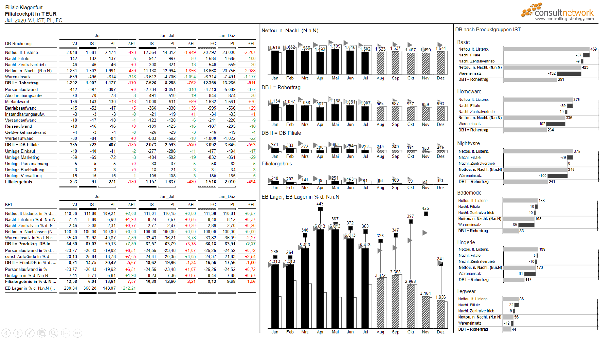
Example of an IBCS standardized report
By adhering to the IBCS guidelines, analysts and designers can overcome the common pitfalls of misleading or confusing charts and unlock the true potential of their data stories. And communicate data with more clarity, consistency and audience comprehension.
Overview of IBCS standardizations
IBCS aims to improve the clarity, efficiency, and credibility of business communication through standardized chart design. Some of the key aspects of charts that are standardized by IBCS include:
- Chart types: IBCS recommends specific chart types for different data scenarios to ensure the accurate representation and easy comprehension of information. For example, bar charts for comparing values, line charts for depicting trends over time, and waterfall charts for illustrating changes in cumulative values.
- Color coding: IBCS defines a standardized color scheme for charts. This palette assigns specific colors to different categories or data elements, facilitating consistent interpretation across charts and reports. It ensures that colors are used meaningfully and consistently, without confusing or misleading the audience.
- Axes and scales: IBCS emphasizes the proper labeling and scaling of axes to provide clear context and enable accurate interpretation. Axes should be labeled with meaningful titles, units, and scales. Additionally, IBCS encourages the use of reference lines or target lines to highlight important values or benchmarks.
- Titles and labels: IBCS recommends clear and informative titles for charts, explaining the main purpose or message of the chart. Axis labels, data labels, and legends should also be used to provide additional context and help interpret the data accurately.
- Data-ink ratio: IBCS promotes the concept of data-ink ratio, which emphasizes maximizing the amount of ink or graphical elements used to represent the data itself, while minimizing non-essential elements. This helps reduce clutter and focuses the audience's attention on the most important information.
- Chart consistency: IBCS encourages consistency in chart design throughout an organization's communication materials. This includes consistent chart layouts, formats, and styles across different reports and presentations, making it easier for the audience to interpret and compare information.
By adhering to these standardized aspects, businesses can enhance the effectiveness of their charts, promote clearer communication, and facilitate better decision-making.
Recommended introductory resources
With this basic understanding of IBCS, you can delve into the following resources to expand your knowledge and proficiency in this field:
1. The classic book: Solid Outlined Hatched (by Hichert & Faisst)
This reference book provides insights into how visual consistency can enhance communication in reports, presentations, and dashboards. The authors draw inspiration from disciplines like music and engineering, which utilize "notation standards," and apply the same concept to business communication. They introduce a visual reporting language that can be applied to charts, tables, and other elements commonly used in business reports, presentation slides, and management information systems.
The book includes practical examples that demonstrate the effectiveness of the proposed approach. It covers topics such as pattern recognition, the significance of signs, developing a visual reporting language, templates for report objects and analyses, implementing standardized reporting, creating a notation manual with real-life examples, and addressing acceptance and dissemination of these standards.
2. Webinar: "Design Power BI Reports That Everyone Understands"
Throughout the webinar, Andrew Lapajne from Zebra BI and Rolf Hichert from IBCS delve into various aspects of report design, sharing practical tips and insights to help BI analysts develop reports and dashboards that are easy to understand. The focus is on simplifying complex information, ensuring clear communication, and enabling actionable insights.
Design Power BI Reports That Everyone Understands | IBCS Standards Rolf Hichert | Zebra BI Webinar
The video emphasizes the principle of "What means the same should look the same," which serves as a guiding mantra for creating reports that are easy to understand. Hichert, known as "The Guru of Management Reporting," shares valuable insights into the world of report design.
One of the key takeaways from the video is the need to avoid typical mistakes that plague report design, such as choosing inappropriate charts, utilizing poor labels, and incorporating inconsistent colors. These errors not only hinder comprehension but also contribute to the lack of consistency across reports created by different individuals within an organization.
3. Free International Business Communication Standards PDF
IBCS offers their 160 page detailed IBCS guide for free if you register on their site.
Closing thoughts: The allure and impact of IBCS
In conclusion, IBCS represents a paradigm shift in business charting, providing a standardized framework to improve clarity, consistency, and comprehension of data visualizations. By adopting IBCS principles, we can elevate our data storytelling capabilities and ensure that our charts deliver the intended message with precision and impact.
I am genuinely captivated by IBCS due to its remarkable ability to enhance the clarity and legibility of reports, making data more easily accessible to a wider audience.
As a devoted design and data visualization enthusiast, I am particularly drawn to the aesthetic appeal of IBCS reports. The simplicity and consistency they embody resonate strongly with graphic design principles, further reinforcing my admiration for this powerful communication framework.
Happy reporting! ∎
You’re into data design too?Then let’s connect on LinkedIn and exchange thoughts on
data, design, and visual storytelling.
data, design, and visual storytelling.